
Flo Mobile Redesign
Role:
Product Designer
Team:
4 Designers
Time:
February - April 2024
Skills:
UX Research
Interactive Design
Prototyping
Tools:
Figma
Figjam
CONTEXT
Brief
Flo is a holistic health app that allows you to track your period, symptoms, chances of pregnancy, and your baby’s growth and development. Additionally, Flo provides insights into body signals, evidence-based health articles, and much more.
Problem
Flo’s design and branding limit accessibility by marketing itself strictly as a female health app, using exclusive language that alienates users beyond the female binary and dismisses the diverse realities of menstruation. This lack of inclusivity is compounded by a restrictive paywall structure that hinders access to essential health resources, ultimately diminishing the overall user experience.
USER RESEARCH
Competitive Analysis
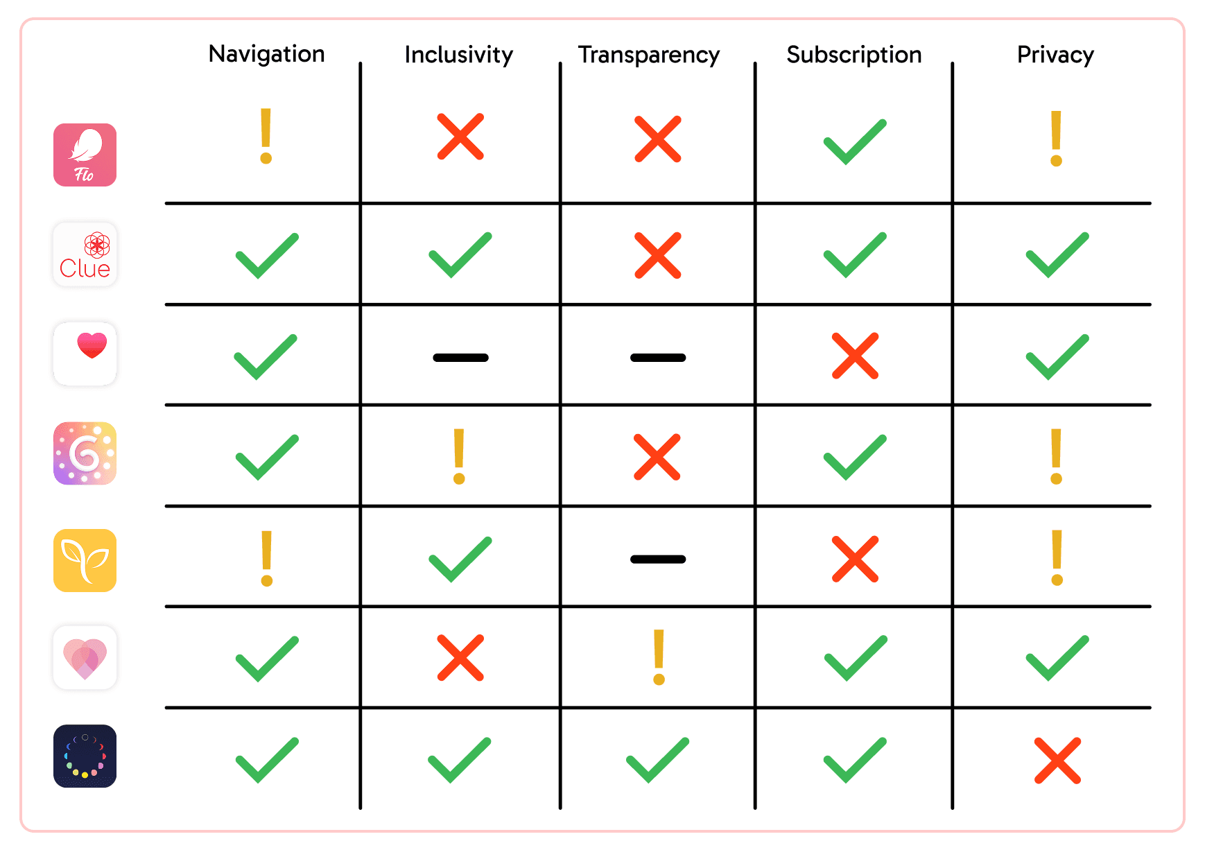
To better understand the UI of period-tracking apps, we conducted a competitive analysis of Clue, Apple Health, Glow, Ovia, Clover, and Stardust. Each app was evaluated on navigation, inclusivity, transparency, subscription/paywalls, and privacy. Our findings revealed notable differences: Clue, Ovia, and Stardust stood out for inclusivity, while Flo, Glow, and Clover fell short. Apple Health offered a more generic experience due to its minimal UI. Most subscription-based apps, aside from Stardust, lacked transparency around free versus paid features. Privacy was also a concern, as apps like Flo, Glow, Ovia, and Stardust have previously sold user data despite their stated privacy commitments.
User Interviews
We conducted 12 user interviews and launched a survey around gender identify and inclusivity, usability, paywall, and privacy to gain a better understanding of users personal experiences with Flo. After gathering data, we identified a few common insights across our users.

User Personas & Journeys
To deepen our insights, we developed two user personas that captured our target audience’s needs and pain points. We then mapped their user journeys to visualize the end-to-end experience and identify opportunities for improvement through ‘how might we’ questions.

IDEATION
Information Architecture
After noting down user frustrations and needs, we reconstructed and mapped out the information architecture. The primary change involved removing the Messages and Partner pages from the navigation bar and moving them onto other pages streamline navigation and enhance usability.

DESIGN & USER TESTING
Sketches
Each of us took two to three pages from the navigation bar and created low-fidelity sketches. We then came together to share perspectives, merge concepts, and refine our thinking—ultimately identifying key features that best addressed our insights.

Mid-Fidelity Designs
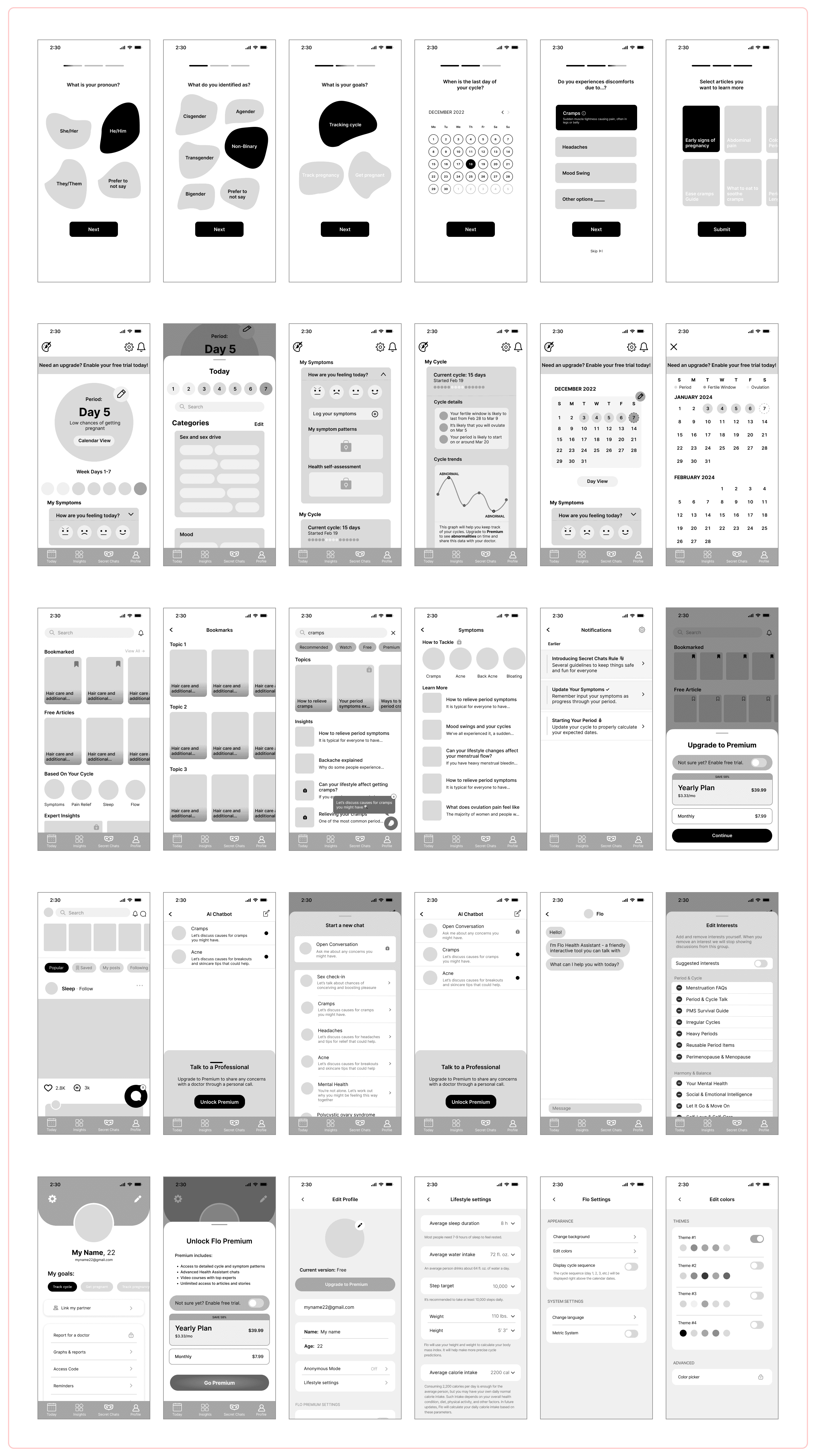
After sketching low-fidelity screens, we moved into mid-fidelity wireframes to build user flows and conduct testing. This stage allowed us to merge ideas from our sketches, iterate on new concepts, and refine designs through continuous feedback and collaboration. Below are some of the key screens we developed.
User Testing Insights
Icon Placement Challenges
Users expressed frustration when trying to interact with certain icons, such as the edit icon on the ‘Edit Interests’ page and the AI chatbot pop-up on the ‘Secret Chats’ page
Feature Usage
Tracking physical conditions would be more useful than mood trackers
Ad Frustrations
Want better ad placement and clearer notions for closing out of the premium ad pop up
FINAL DESIGNS
Onboarding Prototype
We redesigned the onboarding to be more inclusive by adding questions about pronouns and gender identity and replacing the pink flower designs with a gradient to move away from feminine imagery. To address the original onboarding’s length, we also introduced a skip button and a progress tracker to make the process more manageable.
Today Prototype
We preserved the overall design of the Today page to maintain a familiar UI, while relocating certain features to the Secret Chat screen to reduce information overload and improve organization. Dropdown menus streamlined content on app launch, creating a cleaner interface. Lock icons were added to clearly distinguish free features from subscription-only ones.
Insights Prototype
The primary issue with the insight screen was the lack of clarity regarding free versus paid articles, with nearly all articles directing users to a subscription page. To address this, lock icons were added to signify premium articles, preventing users from being misled and reducing constant encounters with Flo's subscription prompt. The subscription screen was also transformed into a half-screen popup, making it less intrusive while remaining noticeable. Additionally, we introduced filters to enhance the search experience.
Secret Chat Prototype
The initial design of Secret Chat was user-friendly and free of major issues. The two most significant changes were the introduction of Flo "stories" and a chatbot feature. Originally, Flo "stories" were part of the Today page, but I decided they fit better on the social screen to align with the UI of other social apps.
Profile Prototype
Flo lacks a profile icon in the navigation bar and doesn’t provide a dedicated profile page—users can only access settings to adjust goals or change their picture. To streamline the experience, we consolidated settings into a new profile page. In our redesign, we also removed the ‘Partner’ tab from the navigation bar, since it’s a premium feature with limited use, and introduced a customizable color scheme to enhance personalization
REFLECTION
Being intentional with every step.
At times, I wanted to add or change features simply because I thought they would be useful. Testing quickly showed me otherwise. I learned the importance of grounding design decisions in research and data, since user reactions aren’t always predictable or easy to assume.
Design is far from linear.
This was my first full redesign project, and I quickly realized that design isn’t a neat, step-by-step process. I often found myself going back and forth between iterations, even revisiting the ideation phase multiple times before landing on a direction. What I thought would be linear turned out to be far more dynamic—and that’s what made it exciting. Design is an ongoing process of exploration, iteration, and refinement, with so much thought and care poured into every decision.
If I had more time…
I would have liked to conduct A/B testing on color schemes and create more prototypes beyond just key interactions. This would have allowed us to explore more aspects of the experience and ensure our designs worked seamlessly. That said, I’m proud of the project’s outcome and grateful for the support our team received from colleagues on other projects.